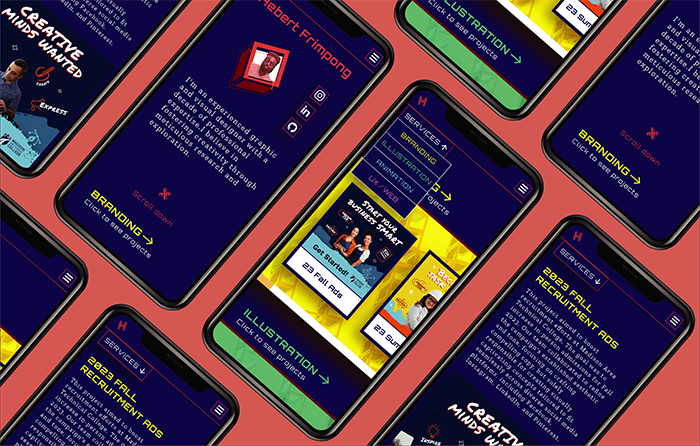
Overview
Year: April 2024
Role: UX Researcher, UX/UI designer
Toolkit: Figma, Adobe CC, FigJam, Pencil and paper
Background
In May 2020, amidst the widespread closures due to the COVID-19 pandemic, I completed my master's project and geared up for a new chapter in my career: job hunting. Equipped with fundamental HTML and CSS skills from my web design class, I quickly built a somewhat responsive portfolio to aid my job search.
Four years later, and I have navigated through roles with two distinct employers. Along this journey, I have honed my expertise in UX and web design, accumulating valuable insights and experiences along the way.
Problem
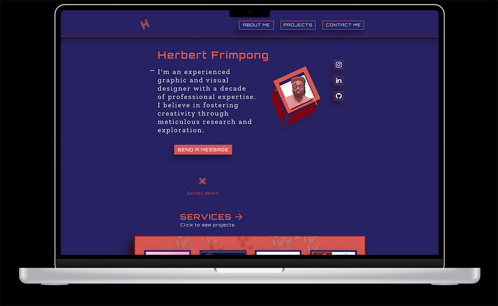
Build a new portfolio website that reflects my professional growth.
Key Drivers
- Resume and Experience
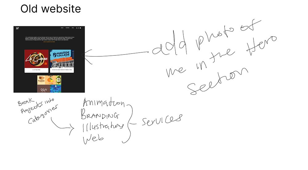
- Services
- Projects
- Contact
Target Audience
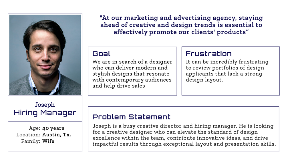
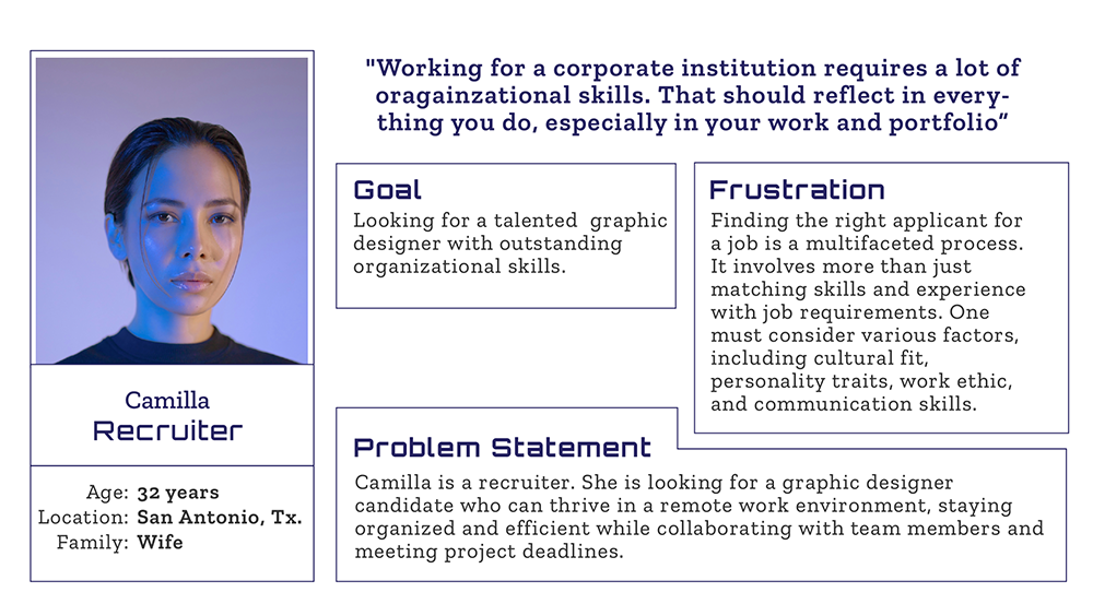
- Hiring Managers
- Recruiters
The current website?
I wanted to have a clear picture of what recruiters and employers think about my current website.
Methods
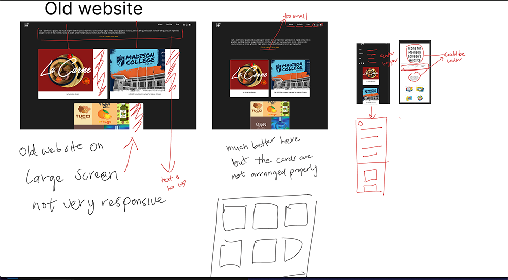
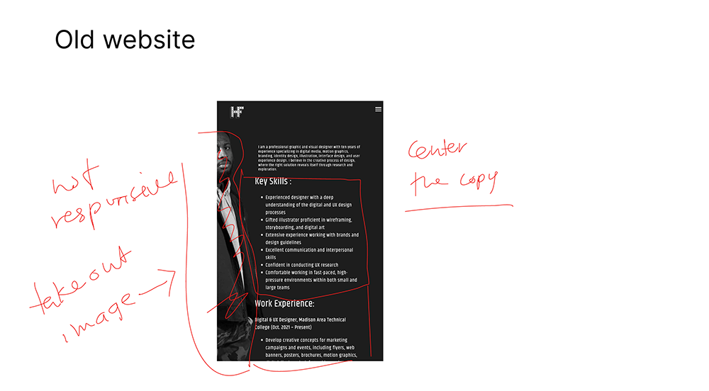
- Web pages are not responsive.
- Accessiblilty issues (Text is too small)
- The projects are not streamlined or categorized
- Resume or About Me section is not formatted properly
Qualitative and Quantitative Data
By performing in-person interviews and conducting surveys outlined some of the issues I already know.
Personas
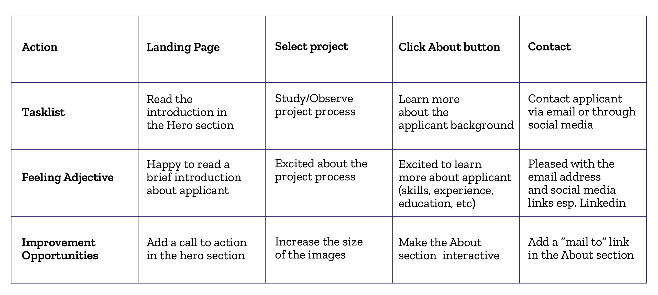
User Journey Map
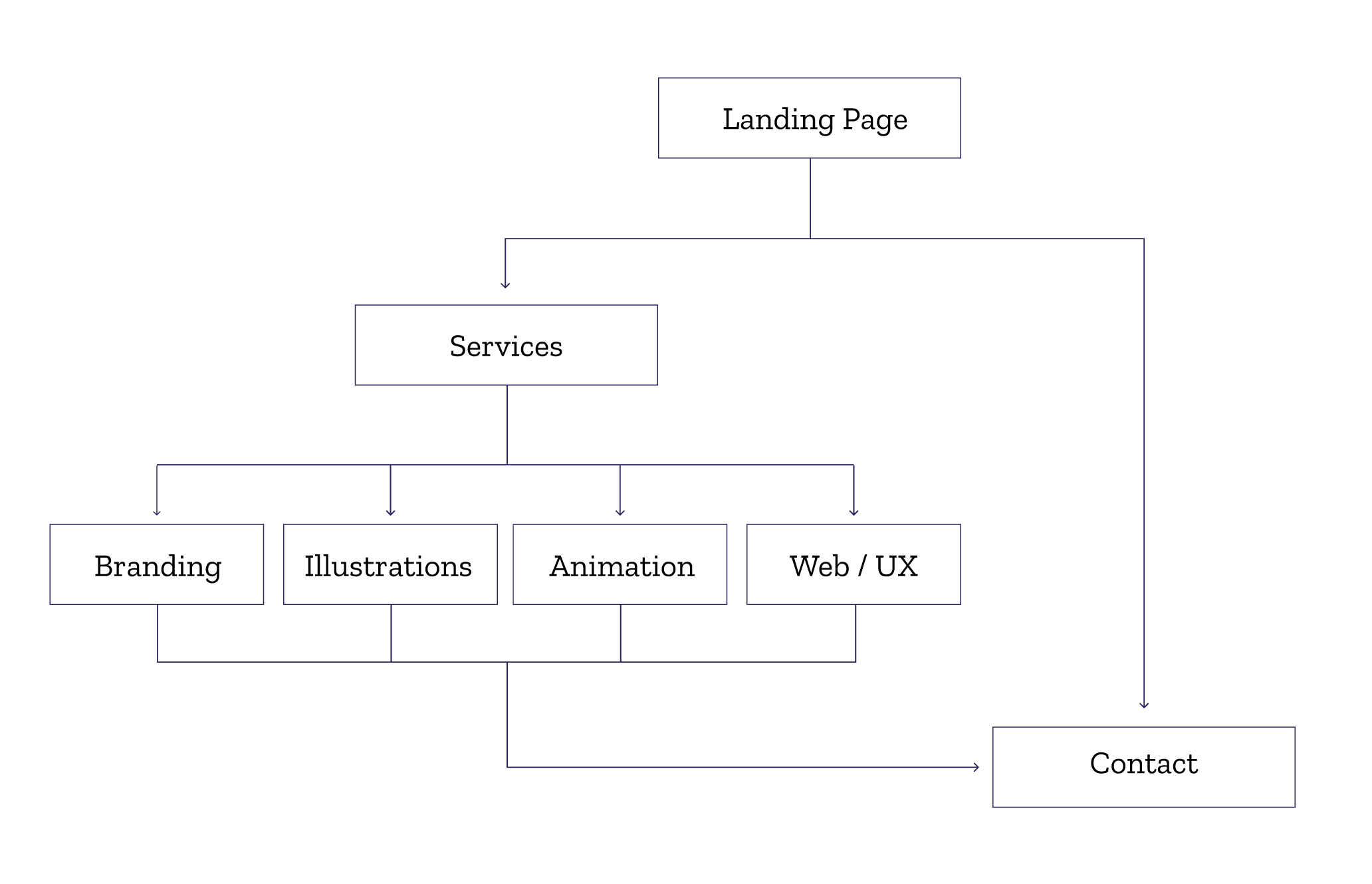
User Flow
Sketches
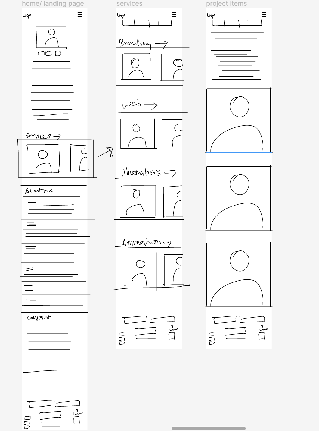
Ideas To Action
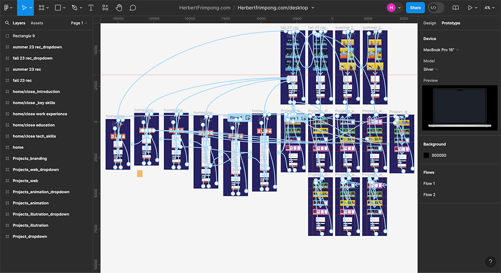
I utilized Figma to explore numerous ideas and brainstorm various possibilities. I created low-fidelity wireframes and a prototype to test and refine my concepts.
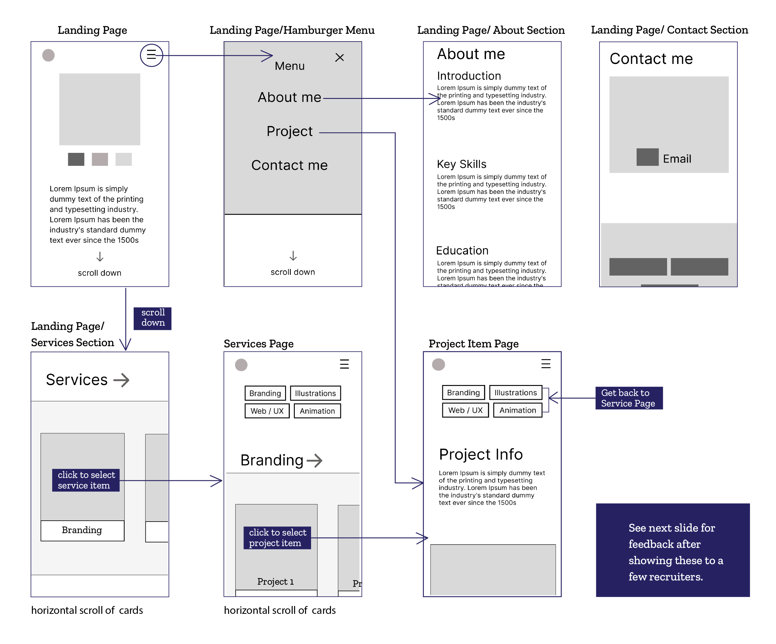
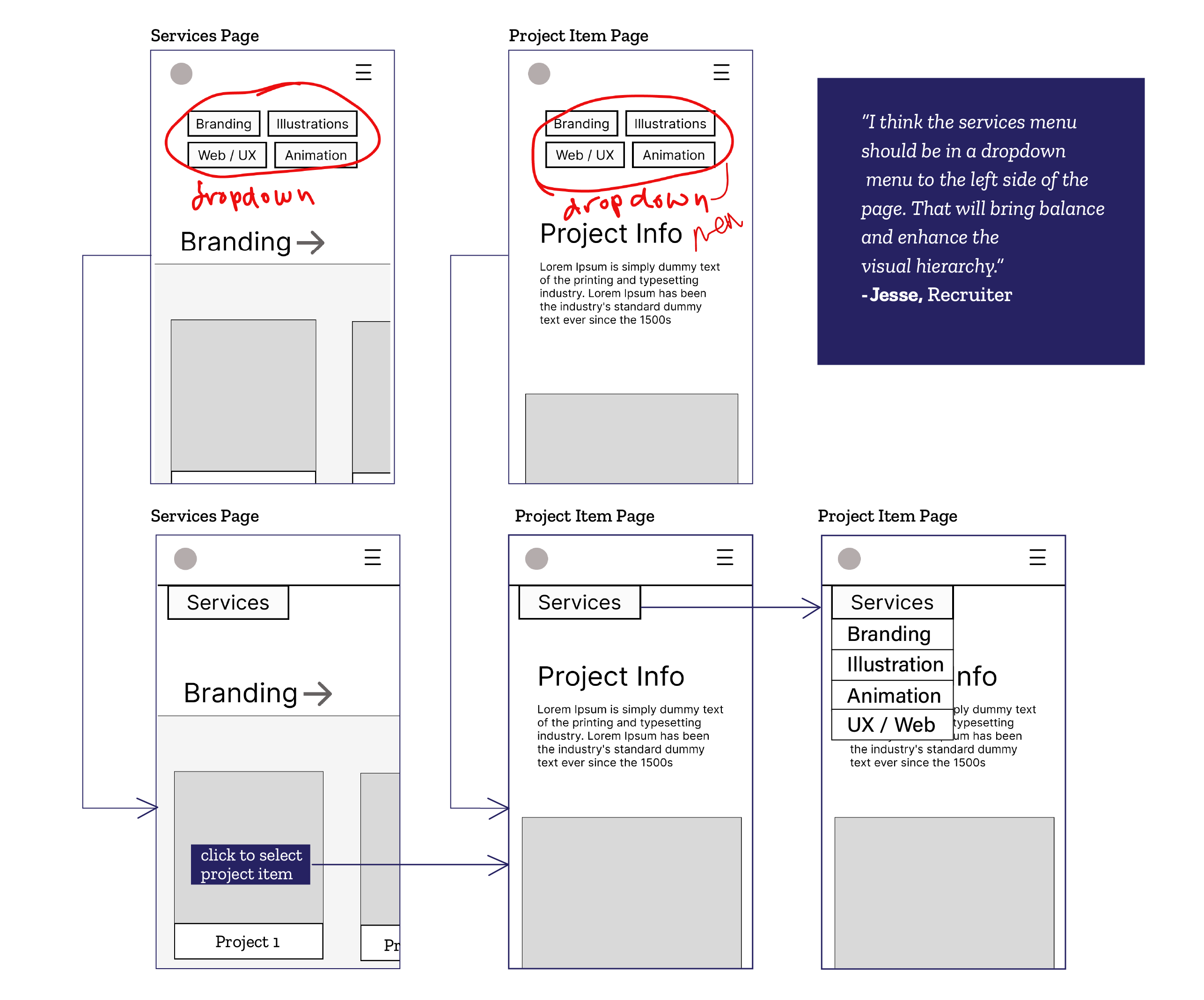
Feedback
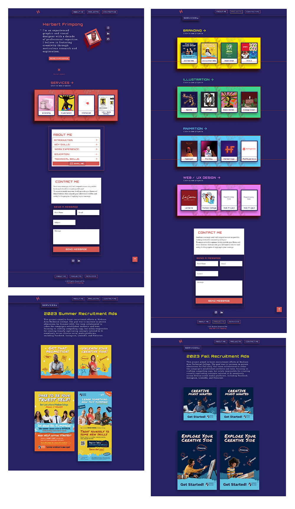
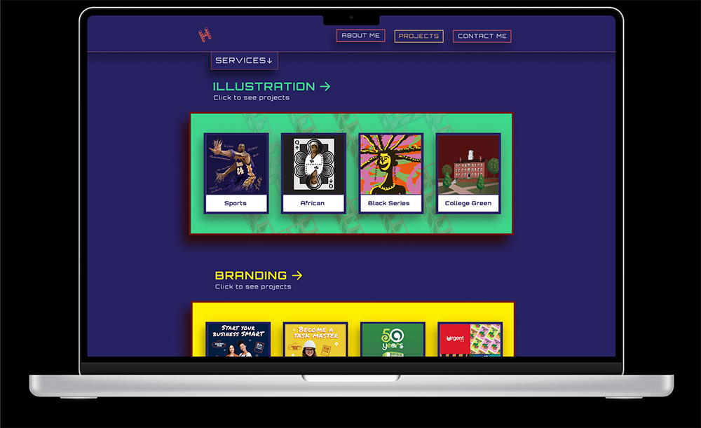
After testing the initial version of my wireframes, I realized that it would be more effective to streamline the service items on both my Service and Projects pages by condensing them into a dropdown menu.
Design System
Colors
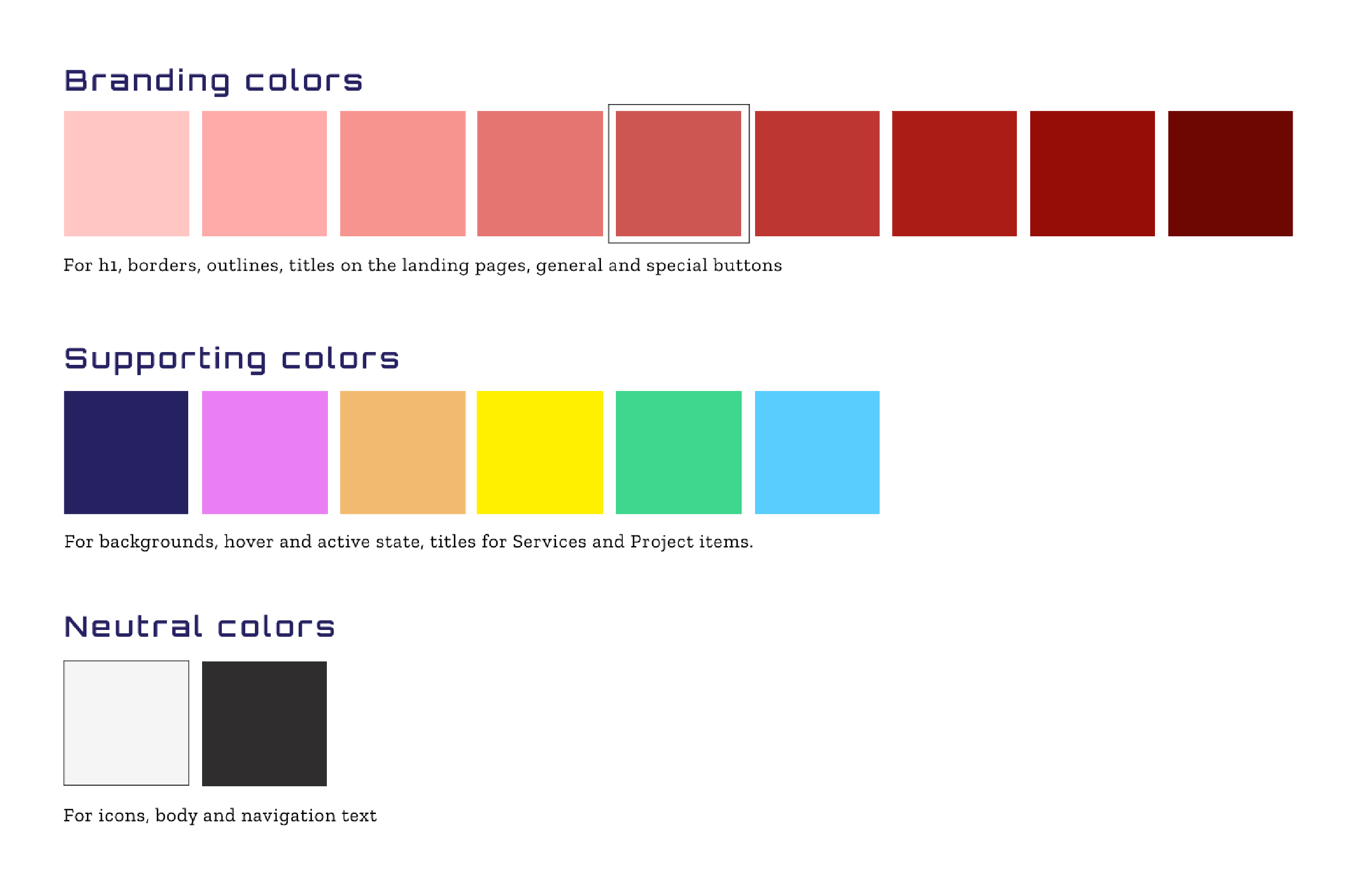
Over the past five years, I've noticed a significant shift in design trends toward embracing bright and vibrant color palettes.
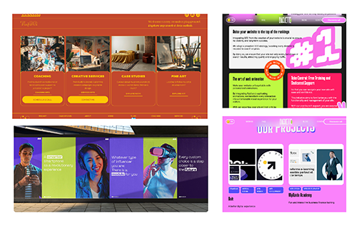
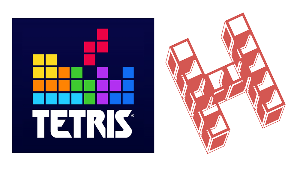
My logo draws inspiration from the classic game Tetris, which holds a special place in my heart as a childhood favorite. I'm intrigued by the game's core concept, which teaches us that sacrifice is often necessary for progress..
Typography
Spacing
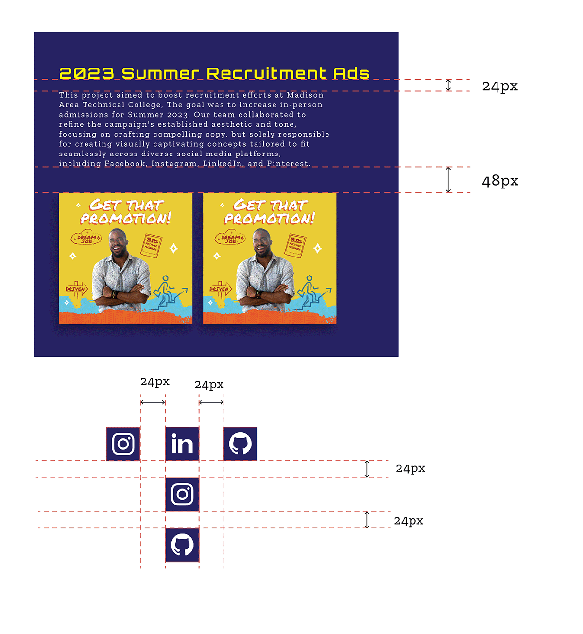
Icons
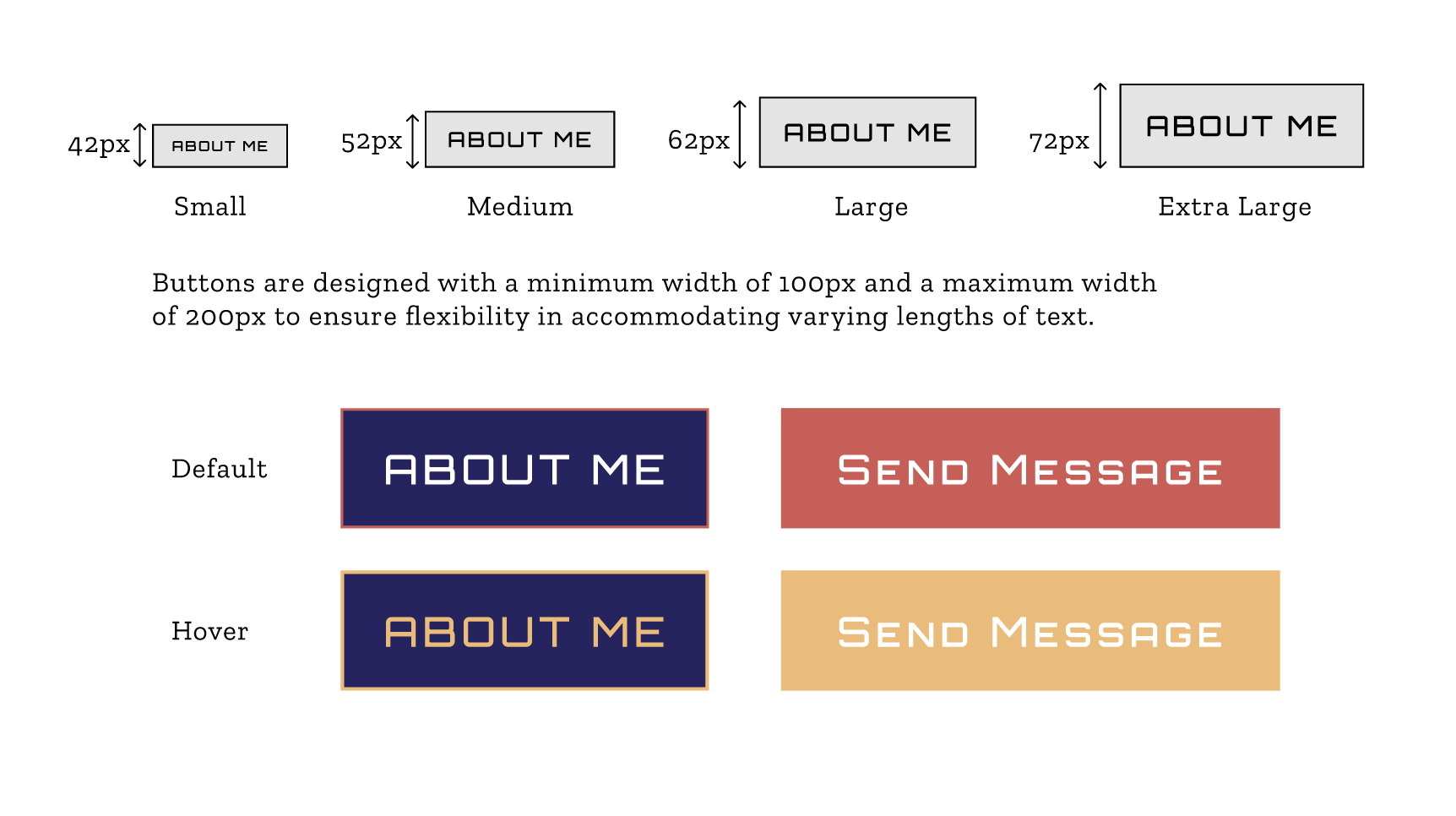
Buttons
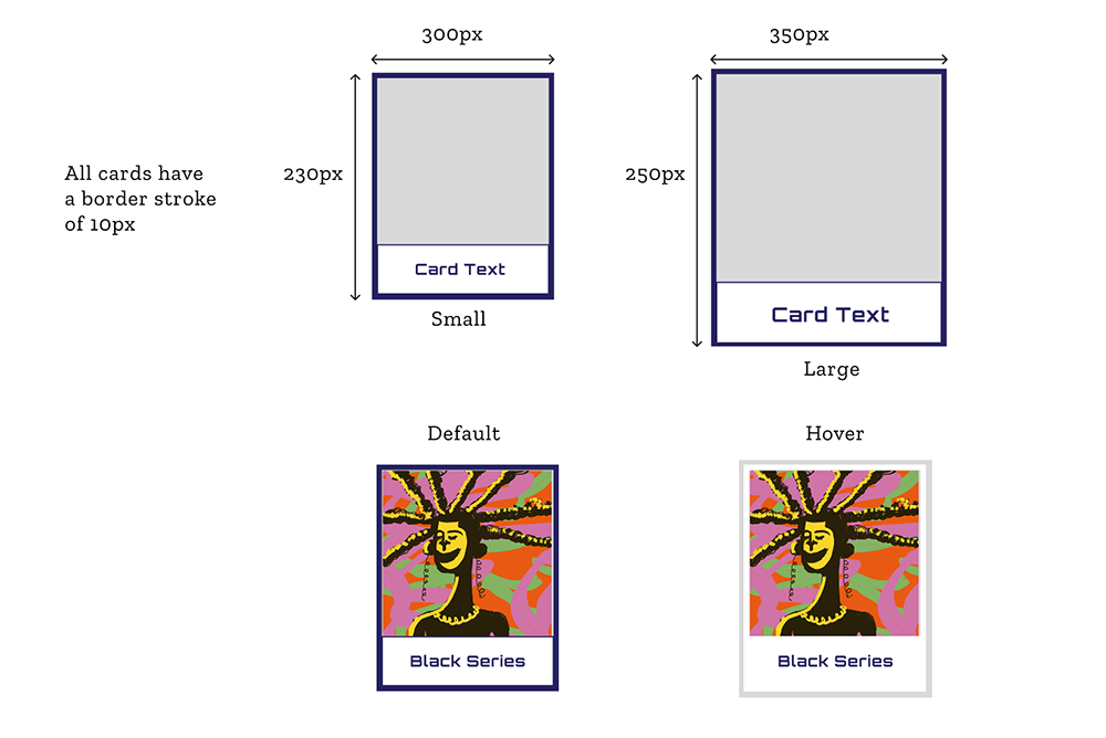
Cards
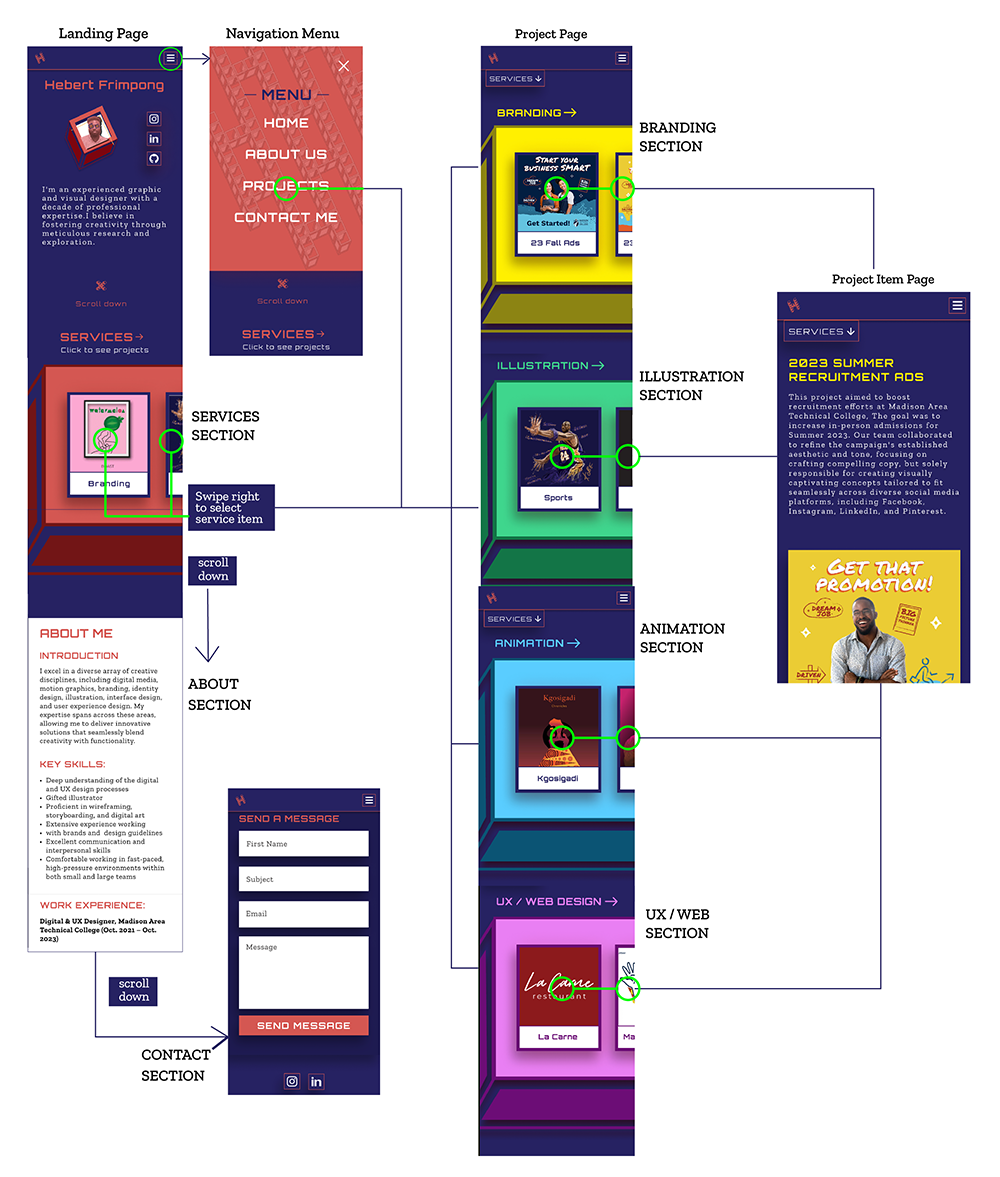
Hi-fidelity V1 - Mobile
Findings
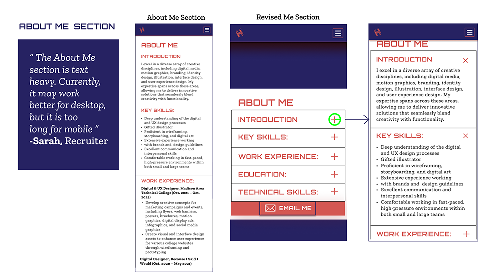
- The About Me section is too long, and I have to think of a way to make it interesting for users.
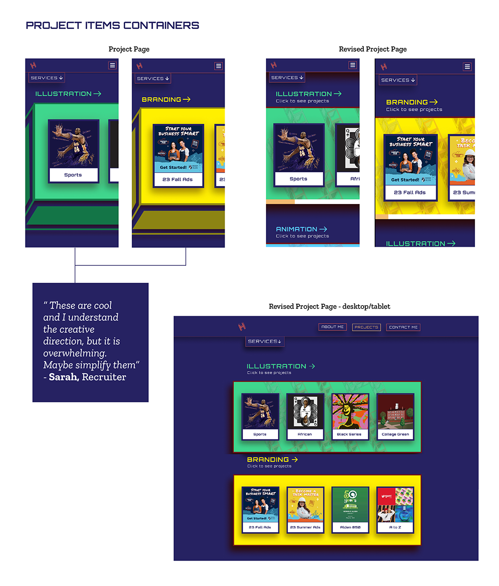
Two (2) major discoveries:
- The project item containers are overwhelming.
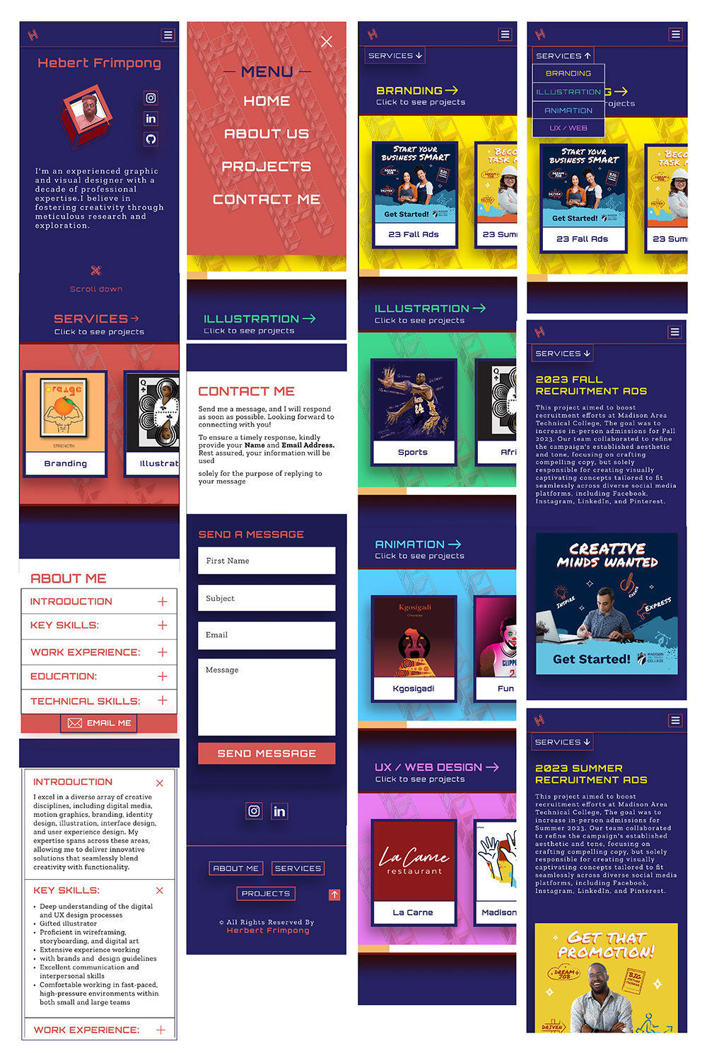
Hi-fidelity V2 - Mobile
Hi-fidelity V2 - Desktop
