La Carne
This case study was a pivotal project completed during my Google Career Certificate in UX Design journey. From conducting comprehensive research to define key problems, to meticulously navigating the entire design process, I took ownership of every aspect, particularly focusing on visual design. Through real-time background research, I ensured that the resulting design was not only visually impactful but also meaningful and effective.
Click to see prototype
Introduction
La Carne, a steak restaurant, is seeking to enhance its customer experience by introducing its own ordering and delivery app. While relying on third-party apps like DoorDash and Uber Eats in recent years, La Carne now aims to streamline its services and offer a more personalized experience to its customers through a dedicated app.
Challenge
The challenge for this project is to design and develop a mobile ordering and delivery app specifically tailored for La Carne, providing an intuitive and seamless experience for its customers.
Solution
La Carne App allows customers of the La Carne restaurant to order their favorite dishes with the option of delivery and pickup at their own convenience.
Target Audience
- Business Executives
- CEO
- Doctors
- Lawyers
Upper class:
- Civil Servants
- Health Workers
- University Workers
- Students
Middle class:
User Research
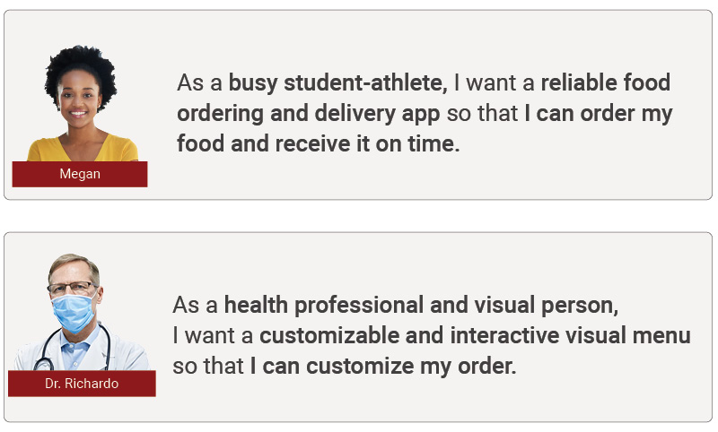
I focused on two primary target audience groups:
- Doctors (Upper class)
- Students (Middle class).
Role and Timeline
This is a personal project that took me 12 weeks to complete.
Design Process
I adopted the five-step design thinking process:
-
Empathy
-
User Survey
-
Problem Finding
-
-
Define
-
User Research
-
User Persona
-
User Journey
-
-
Ideate
-
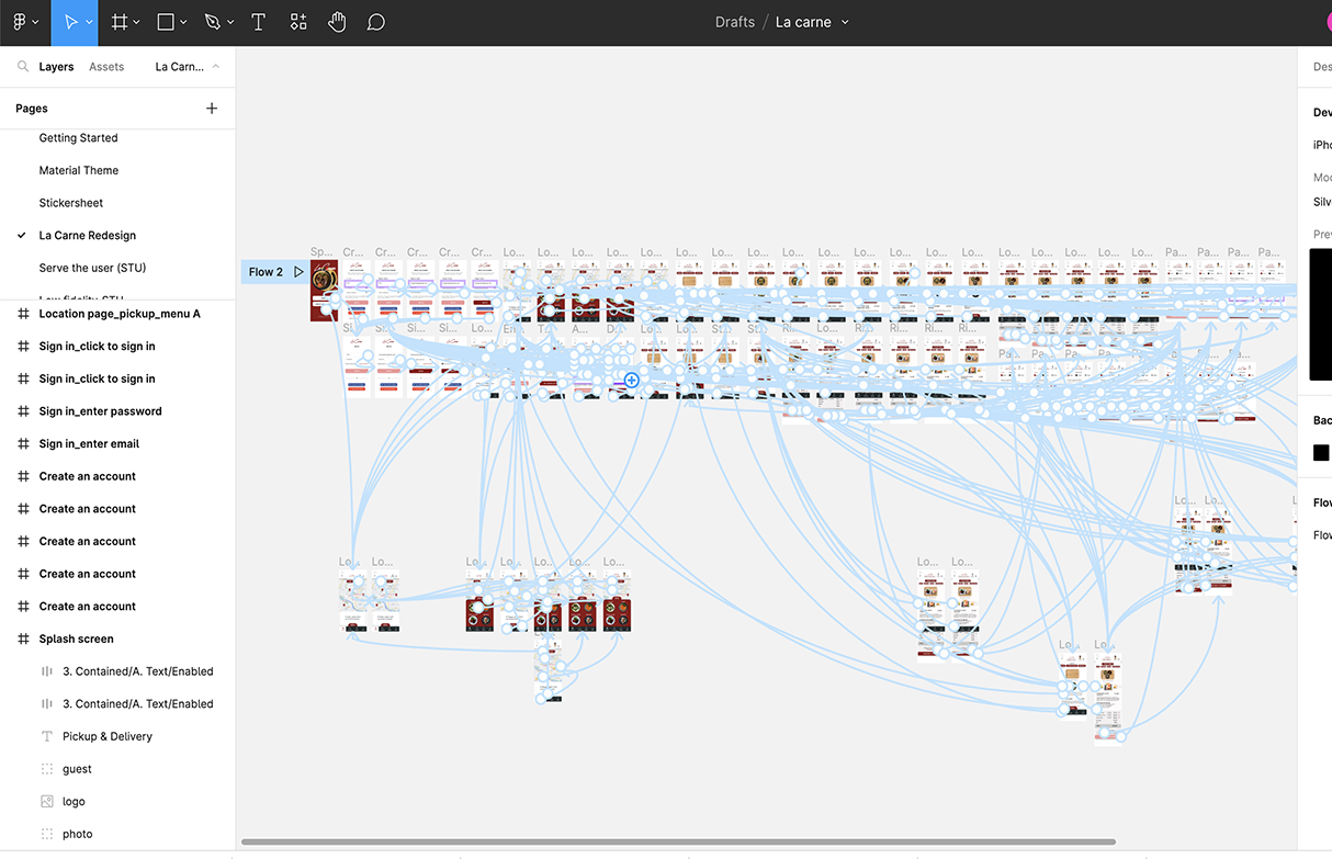
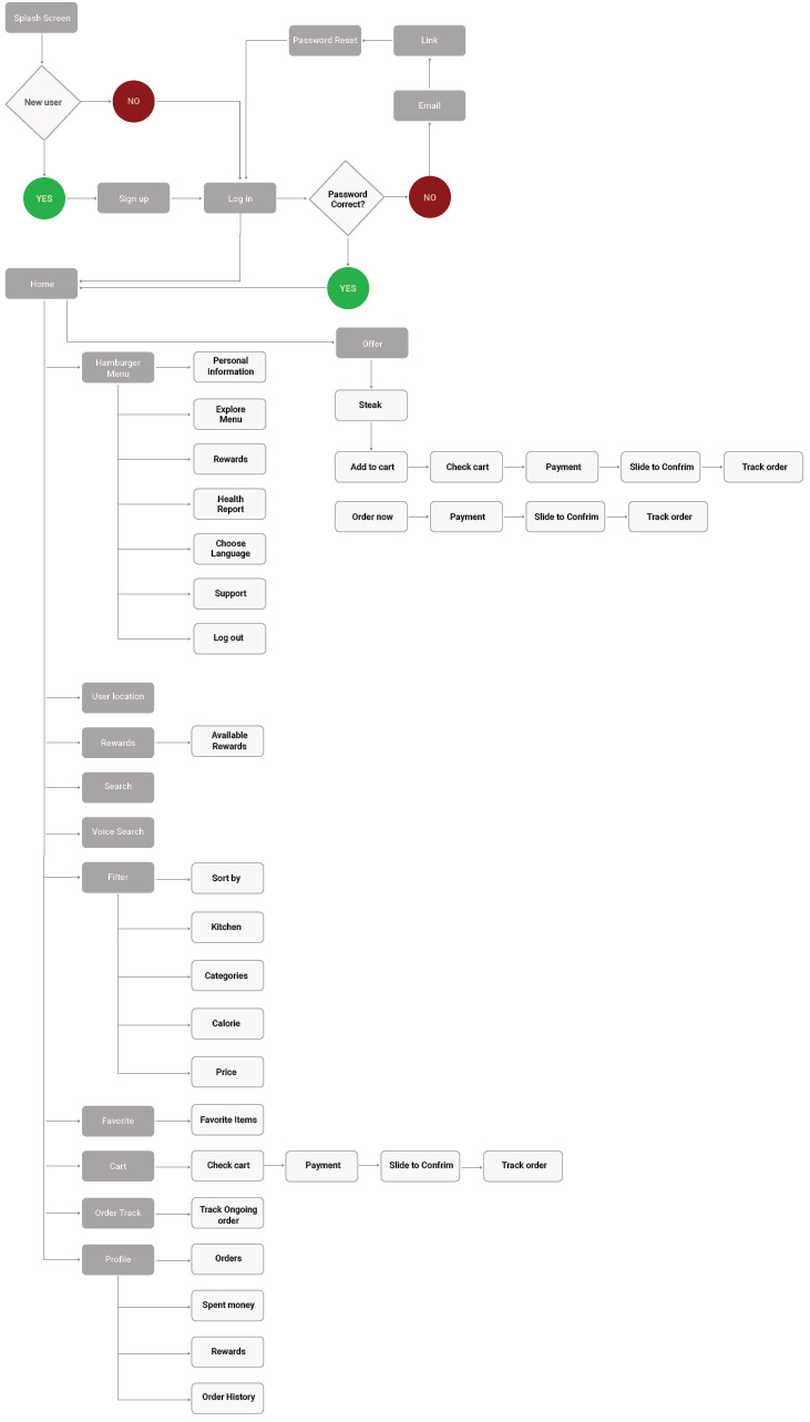
User Flow
-
Information Architecture
-
-
Prototype
-
Wireframing
-
-
Test
-
Usability Testing
-
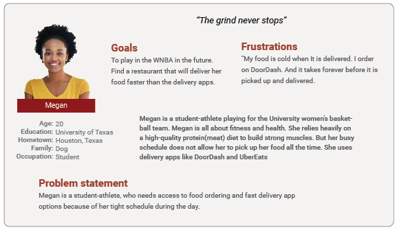
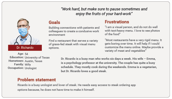
User Personas
User Story
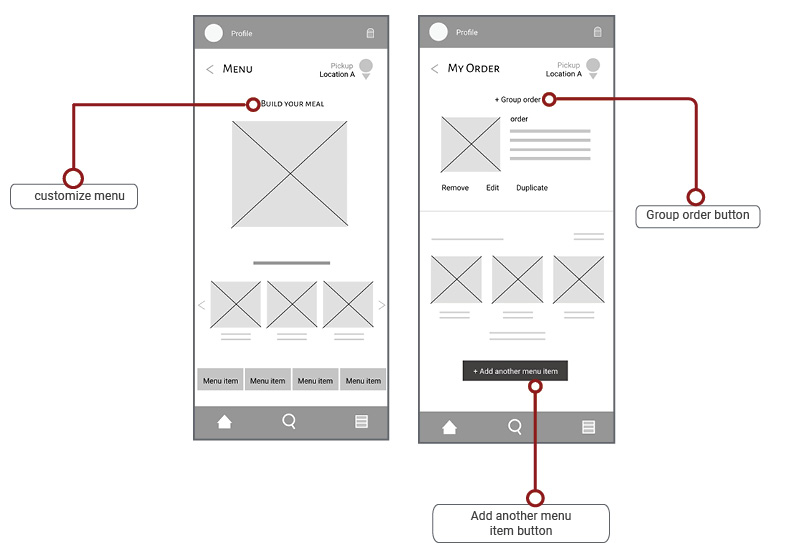
- Lack of food customization options.
- Text-heavy menu.
- Inconsistent delivery times.
- Absence of nutritional information for health-conscious customers regarding calorie intake.
User Pain Points
- The app will include a feature that allows users to customize their orders according to their preferences.
- The app will feature a visually appealing and interactive menu, enhancing user experience and ease of navigation.
- The app will offer order tracking functionality and provide users with delivery time options, ensuring transparency and convenience in their ordering experience
- The app will include calorie information for menu items, empowering users to make informed decisions about their personal health and dietary choices.
Solutions
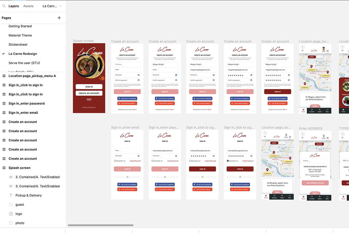
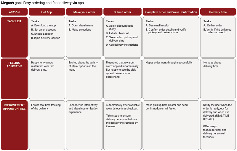
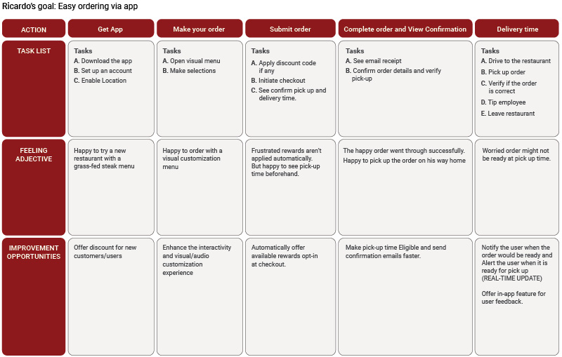
User Journey Map
User Flow
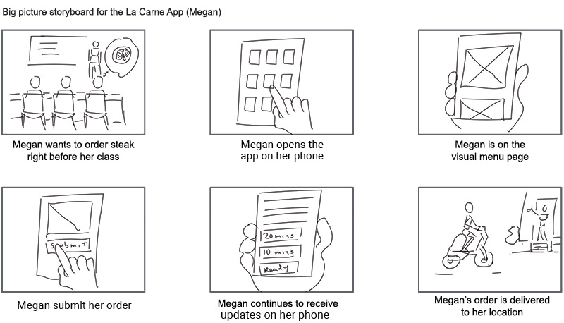
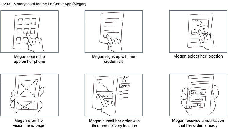
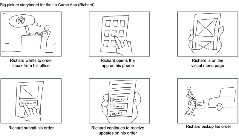
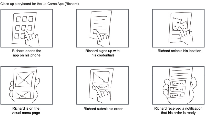
Storyboard
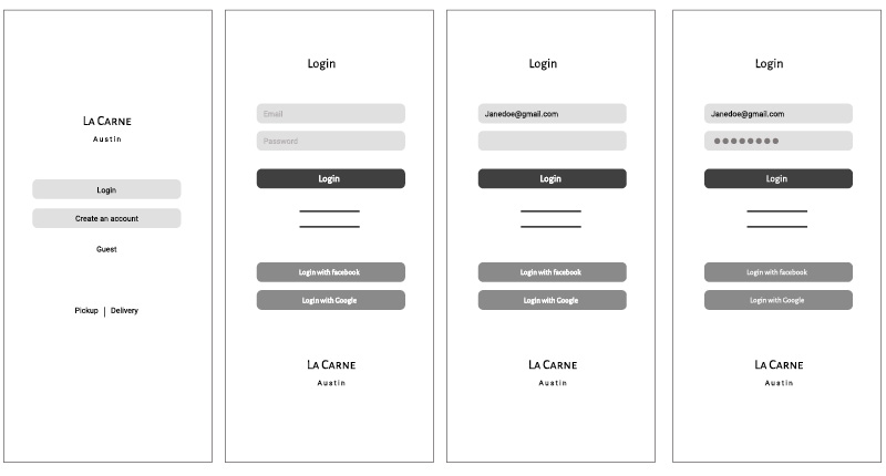
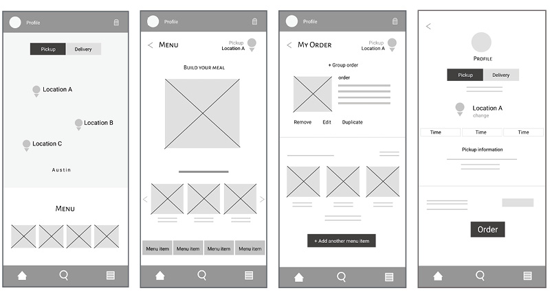
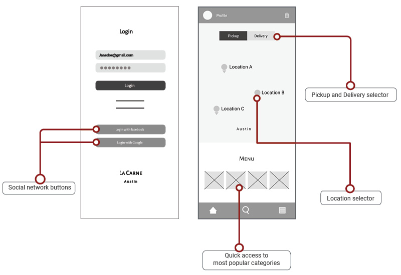
Wireframes
Feedback
After designing the low-fidelity wireframes, I created a prototype to conduct user testing with a select group of participants. I followed my research plan, which outlined the research goals, included questions, defined KPIs, outlined the methodology, provided information about participants, and included scripts with tasks for them to complete.
Pattern Identification
- Observations from user testing revealed that all five participants encountered difficulty creating a new account, as the "Create New Account" link was inactive.
- Observations from user testing indicated that three out of five participants experienced difficulty selecting items from the menu on the checkout page, suggesting that the drag feature in the order menu page is not intuitive enough.
- Observations from user testing revealed that three out of five participants successfully selected a pickup location, indicating that the pickup/change location feature is functional but requires adjustments to improve usability.
- Observations from user testing indicated that all five participants successfully checked out their orders and received confirmations, suggesting that the check page functions very effectively.
Insight identification
-
Creating a New Account: Users struggle with creating a new account.
Insight: Users need better cues or prompts to guide them through the account creation process.
-
Selecting Items in the Menu: Users encounter difficulty selecting items in the menu during checkout.
Insight: Users require more cues or guidance to facilitate this task effectively.
-
Drag and Drop Feature: While the drag and drop feature in the menu page generally works, users need clear instructions to navigate it successfully.
Insight: Providing clear instructions will enhance user understanding and usage of the drag and drop feature.
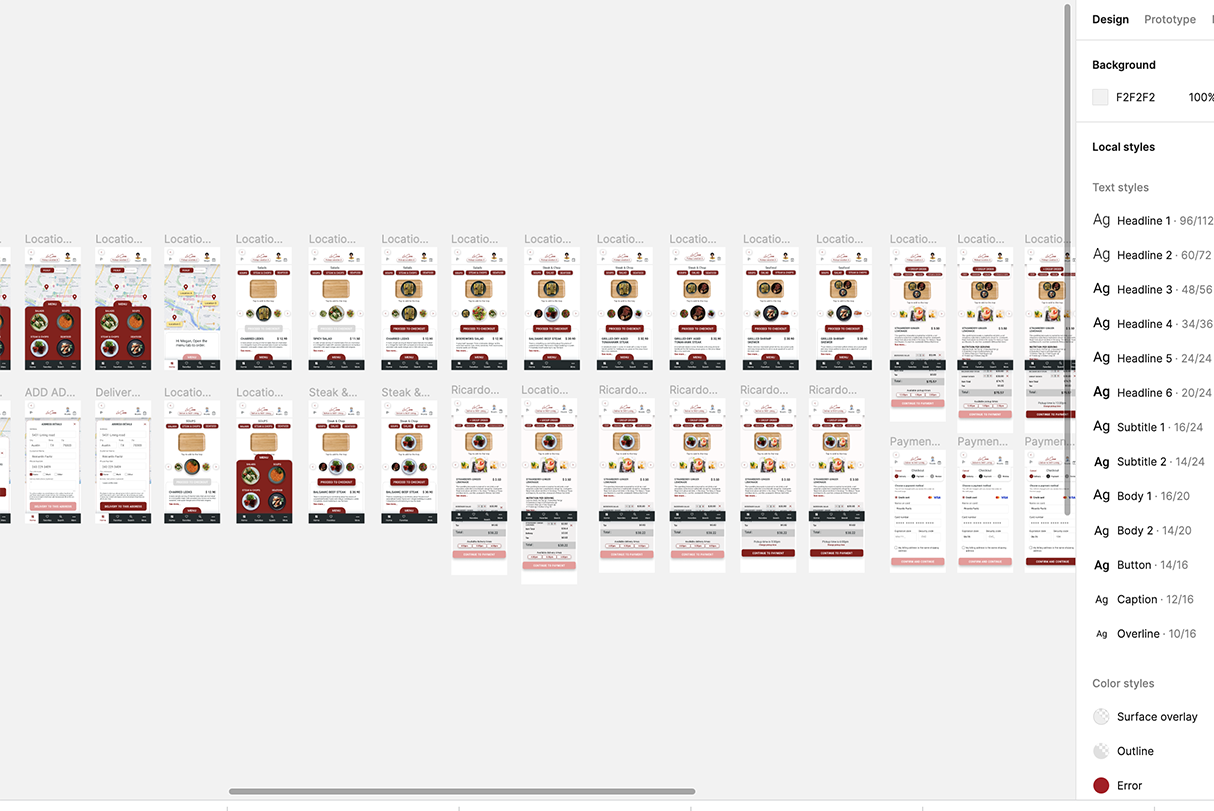
Colors and Typography
A well-chosen color palette paired with the appropriate font is essential for crafting a user-friendly yet elegant design. Drawing inspiration from the color of meat, my palette features rich red hues reminiscent of steak, complemented by two shades of black to evoke the process of cooking and savoring a delicious meal.
-
#8D1616
Red -
#413F3F
Charcoal -
#686262
Smoke -
#f5f2f2
White Smoke
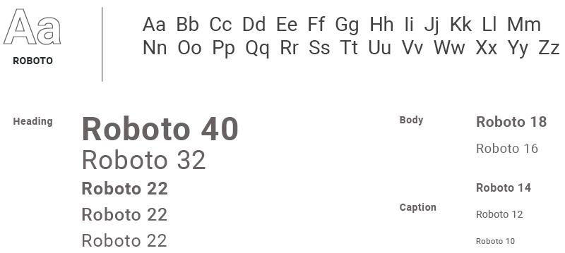
Typography
Prototyping